What colours make brown?
Many people may think that green is the colour of nature but I would argue that brown is the one. It is the colour of mud through which all the rest of green emerges. Let us not underestimate this colour and see for ourselves what colours make brown? There is a whole understanding to undergo behind this because it is a tricky matter. Colours depend upon the perception of a person the way their brain interprets it. Brown is a composite colour and its perception will vary depending upon many other factors.
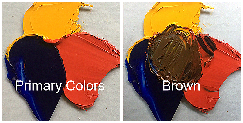
The three primary colours red, blue and yellow can be easily used to make brown. Red and yellow can make orange after that by mixing blue in it you can have brown. The colour television screen also uses green and red to make brown colour to view. Since all the colours have different shades brown also comes in all shades. So when you know what colours make brown you can change the proportion of the colours and then get whatever shades you need. The different types of brown colours need separate mixing which will give different shades.
Basic Brown
The medium shade of brown can be achieved by mixing blue, yellow and red. In case there are just two colours available then you can add blue with orange to make this particular shade of brown. Whatever the colours among these two options are added it should be taken in equal quantities so that a medium shade is obtained. This simple formula of keeping the proportions equal works well because you will know what you are getting. In case you want to have a lighter or darker version of brown then the proportions can be changed. However this will need experimentation first and then the colours would come up. Take smaller quantities of colours to see the results and then go for the actual task.
The fun part with brown is that whichever colour is mixed it can give away brown eventually. If you have messed up the colours it will give brown. So in case of brown sky is the limit, play with the colours and see the shades and hues coming up.

Tan
Tan is a lighter shade of brown so what colours make brown which is the lightest of shade. Well that will only require lighter shades to mix. Whenever you have to aid colours that are lighter in shade then one thing to keep in mind is that adding much of white will keep the colour as much light as possible. Tan can be achieved by adding more yellow colour to brown. If any more lighter shade is required then white can be used. Making a bit more lighter can turn it into pinkish shade so to avoid that while making the basic brown shade do not add red into it. Rather go for he options which do not have red so that when white is added to make the brown colour lighter it doesn’t turn out to be pink.

Beige
Lighter colours are easier to achieve because all you have to do is add white to it. Whatever shade you want you can add white to your desire and see for the required shade. Same principle goes for the colour beige which is a very light shade of brown. You just have to go reverse in a way that you are going to take white colour first and then adds brown in much lesser quantity. If you are familiar with the colour beige you will understand what is being implied here. Adding white to brown will need much quantity of colour to reach to the desired shade so it is much easier to attain the hue by adding little brown to white.
Beige will require a tint of red as well because it gives a little bit of pinkish shade as well. The colour may get little darker but it can always be corrected by adding more white or yellow can also help.
https://hips.hearstapps.com/hmg-prod.s3.amazonaws.com/images/beige-colour-trend-1573571043.jpg?crop=0.332xw:0.663xh;0.332xw,0&resize=640:*
Expresso
There is more than one option for getting expresso colour because this is a very dark shade of brown. Take primary colours blue and red and in this case yellow should be excluded since it is a light colour. Much of dark colour can be achieved if more black and purple is added. Purple will not give a bright look to the colour so black will be much better of an option. Both of the colours can also be added for it will give a final smooth look to the colour. A lighter colour desire can be achieved by adding either grey or yellow. White will only lighten it more than required shifting the shade to another dimension.
Chestnut
Chestnut is a pretty brown shade which is actually medium reddish shade of brown, earthy in tone and bright. Yellow and red can be combined together of form the colour chestnut brown. The proportions should not be equal. To get the right kind of colour it simply add a little bit of yellow and then red until the colour of choice is achieved. This may sound incomprehensible but actually whatever shades you’ll be trying to achieve this kind of practise is important because only by trial and error you can learn to mix different colours and get variety of shades. Chestnut is a mild colour and need attention to get the desired consistency.

Brown is ranked the lowest among the colour ranks and is considered dull and boring. It actually is the colour of nature and brings in peace. It is so common to see a brown bag in grocery stores rather it is available at selected exclusive places showing the connection it has with nature. This is why the brown paper bag is considered a symbol of love towards the environment. It depicts simplicity especially when something is wrapped in brown paper the colour only shows dedication nothing overtly ambitious.
Brown is such a nostalgic colour. It reminds us of playing with the paper and not only wrapping gifts in brown paper but also the notebooks. This brings a wave of peace in mind that indulges us in tranquillity. Maybe it is this association with the colour that now this colour is coming back in trends which were in the past it considered so cool. Talk about fashion or interior designing the colour is making its way back. It connects you back to the roots this stands the reason that it is used to depict warmth stability and strength. In addition it also signifies dependability and comfort.
What are colours?
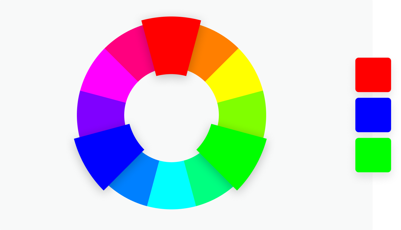
Colours are represented in the form of hue on a colour wheel in the shape of a circle. Primary, secondary and tertiary or intermediate colours are being represented on this wheel with colour temperature. When working in digital terms the hex codes are used to represent the colours.
The primary colours are red, blue and yellow
3 secondary colours are violet, green and orange
6 tertiary colours are red-violet, blue-violet, blue-green, yellow green, yellow orange and red-orange. These are resultant of primary and secondary colour mixing.
This is one basic example of a colour wheel but many people will add in more colours to get a mixture of several primary or secondary colours. These will bring out many different hues on the colour wheel as well. There are well limitless options for mixing the colours and giving newer shades. So options are also limitless for what colours make brown? also.

Colour temperatures
The coolness or warmth of a colour is determined through the colour temperature. What we see as colours is very much effected by colour temperature. Artists need to understand the colour temperature because that creates movement, mood and depth in their work. For example red, orange and yellow are warm colours and green and blue are cool colours.
Scientifically speaking the colours we perceive have a very much influence from their wavelengths. Some colours have short wavelength and cannot be seen from afar and in terms of art they mostly carry the background position or cover the spaces. Warm colours have long wavelength and their strength is used in the foreground due to which the painting will create three dimensional effects.
The use of warm and cool colours can also attribute in size representation as well. for example if someone wants to paint something and trying to bring the smaller details forward then he shall use warm colours which will lift up the work. For details which support the warm tones and look better receded are painted in cool colours. If you come across a painting do notice that the curves or background is in cool shades which helps in the bringing about the actual painting look bigger and better.
Light plays a pivotal role in deciding the cool and warm colours. The cool light will create warm shadows and warm shadows will cool. Playing with these cool and warm colours will create a dazzling effect in the paintings. Artists have more and more options in creating their amazing work of art. So its simple to understand that on a colour wheel red and orange are the warmest colours and when you move in the other direction the colours will get cooler till blue and green and vice versa.
Colour perception however varies and this warm and cool can alternate for one colour tones. One colour appears in many tones due to this reason some shades which appear warmer in one hue will appear cooler in other. For example yellow can turn to be a warm colour next to red but it can also be a cool colour when any of its shade is closer to blue.
This helps in understanding the colour tones better and colour mixing even more interesting. The colours mixed together should be from the similar colour temperatures. When such an idea is pursued in the paintings and art work the result is definitely brilliant. This particular field not only arts but science as well together.

Another important phenomenon here is the temperature dominance. It means the proportion of cool and warm colours. It is suggested that both the temperatures should not be in equal proportions rather their either of them should be dominating the other. If both are kept equal then the result will not be anything appealing. Keeping this imbalance will create an impressive work of art. Artist suggests following activity to understand the textures of cool and warm colours.
- Anything aimed for sketching should be done four times
- The first sketch should be painted with cool colours only
- The second sketch to be painted with warm colours only
- The third painting one temperature should be dominating with the other temperature receding
- In the fourth sketch make a rough painting of half warm and half cool colours.
Finally study all four sketches and see the difference in interest, personal preference, mood and sense of depth. This will give a better understanding of not only the temperature but also how your work of needs to use colour tones to bring a striking piece.
What is a Colour wheel?
Artist and designers use the colour theory to bring about the best colour combinations. It is a combination of since and art which determines the colours that look good together. Isaac Newton in 1666 invented the colour wheel. He mapped out all the colour spectrums in a circle shape which became the foundation of colour theory showing the relationship among the colours.
Colours are not just having visual perspective rather they depict different emotions as well. Colour harmony brings those colours together which look good when brought together and create a specific feeling or look. There are certain rules that need to be followed when working with colour combinations and thus they will bring colour harmonies. Combine their effect will bring a pleasing outcome.
Colour wheels are of two types in which are used either for canvas painting or for online use. RYB are red, yellow and blue wheel which used in canvas paintings by artist for colour combination in their paintings. RGB is red, green and blue wheel which is used in online colouring and uses the effect of light on TV or computer screen.
Colour combinations
Complementary
The colours which are opposite to each other on a colour wheel will give a high contrast and impact. When brought together they will appear more prominent and bright.
Monochromatic
Monochromatic is when a single colour is divided in three different tints or shades giving a conservative and subtle colour combination. It gives a harmonious look when applied to designed projects and also inculcates versatility.
Analogous
The colours which exist side by side on a colour wheel can have an overwhelming and versatile look. This effect can be created when one colour is chosen and the rest ascend in the similar tone.
Triadic
For getting a high contrast scheme of colours but which are lesser than the complementary colour combination, three colours are selected from the colour wheel which are equally spaced between the colour wheels. Vibrant and bold combination results from triadic colours.
Tetradic
This also pretty much similar to triadic just one more colour it. Combining three colours on the palate which are evenly spaced give the bold look. The best combination that’ll work will be the one in which one colour is left to be dominating and others ascending. More than these colours will make it difficult to balance.
Primary, secondary and tertiary colours
The colour wheel consists of twelve basic colours namely rose, magenta, violet, blue, azure, cyan, spring green, green, chartreuse green, yellow, orange and red.
Primary colours
Red, green blue are the primary colours which are present in the colour wheel that create pure white light. This is in RYB colour palette. While in the RGB colour palate these red, green and blue colours cannot be created form any other colour thus are the basic colours.
Secondary colours
These colours are a result of mixing the primary colours. The three colours combined in different tones and shades will bring the secondary colours. In RGB colour wheel red and green are mixed together to make yellow, blue and green are used to make cyan, while red and blue make magenta. So yellow, magenta and cyan make secondary colour palette. In RYB wheel blue and red make purple, yellow and red make orange while blue and yellow makes green.
Tertiary colours
A primary colour mixed with secondary colour gives tertiary colour. The RGB wheel has six tertiary colours rose, violet, azure, spring green, chartreuse green and orange. RYB colour wheel contains red-violet, blue-violet, blue-green, yellow-green, yellow-orange and red-orange as tertiary colours.
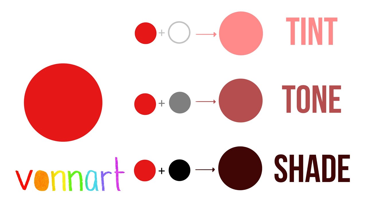
Shades, tints, tones
White, grey or black are used in creating shades, tints and tones to basic hues.
Shade
By darkening the colour a shade is created and this is done by adding black to base hue. A deep and rich colour is created. The impression it asserts can be over powering and dramatic.
Tint
Lightening the colour by adding white to it will create a tint to base hue. Vivid colours can be balanced and the colours used can be less intense through a tint
Tones
Either of grey, white or black is combined to create a tone. A subtle version is gained of the original colour. They are not pastels but certainly reveal the complexities which are not otherwise apparent in the actual colour
Hue, saturation and luminescence
Hue
Any colour on the colour wheel can be referred to as a hue. The variety gives a wide choice to pick from.
Saturation
The purity or intensity of a colour id celled saturation. It means literally to fill up that no space is left.
Luminance
Luminance defines the light or brightness in a colour.

What is white light?
Francesco Maria Grimaldi in 1665 conducted the first ever experiment of splitting of light. He gave this process the name diffraction. In this he simply made the light to pass through a small slit. To his surprise the size of the light was further increased. The light wavelength not only changed but also it was divided into two or three more colours. This result had occupied the minds of scientist like Einstein and Newton for the generation.
In 1665, Francesco Maria Grimaldi, an Italian Jesuit priest, conducted a simple experiment the results of which went on to occupy the minds of several generations of physicists, including Newton and Einstein. This phenomenon stands still till the day and describes the white light.
With further elaboration of his experiment he also found out that the white light not just splits up through a thin slit but also when it hits the edges of something. Why does this happen, the explanation was provided by Isaac Newton
Newton in 1662 started working on his own optical experiments. He first constructed a refracting telescope. He wanted to get rid of the coloured fringes that would appear on the lenses of the telescope by polishing them. However he couldn’t succeed in that. It was 1666 when he passed the light through a prism and it was divided into seven colours. He first observed that happening in his telescope. Although many others had earlier conducted similar experiments but Newton was the first to have declared that white light consists of rays of different colours.
He not just studied the spreading of white light but also the fact that some rays were able to deviate more than others. For example red colour’s deviation is lesser as compared to that of violet light. When light passes through a medium which is transparent like air and goes into another medium like glass it is deflected first as per their colours. This is repeated when the light emerges back into the medium air. This splitting of light is that of a rainbow.
This separation of light in such order is called spectrum.This spectrum consists of colours violet, blue, green, yellow, orange and red. The amount of each colour deviation varies.
How does the eye see colour?
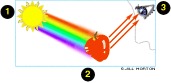
The combination of human eye and brain brings light into colour. The cells in the eye are the light receptors which transmit light message to the brain and produces the sensation of colour. The light is not emerged from the object itself rather the light hitting the surface of the object. It absorbs some part of the light and reflects the rest back. The perception of colour is the light reflected from the object.
For example if we are considering the fact that red is inside the apple that is not the case rather the colour is reflected from the surface and reaches our eye. For white colours there is no absorption of the colour, it reflects all the colours back. Black on the contrary absorbs all the light and does not reflect anything.
The primary colours of the spectrum are red, blue and green. When these colours are combined together in a balanced amount then they can produce white. Rest of the colours can also be produced when the primary colours are mixed in different proportions. Eyes’ cells consist of specialised cells called rods and cones like their shape. The retina is full of these cells. Rods differentiate between light and dark while cones recognise the colours. These receptors take up the information from environment and send it to the brain to be interpreted by the brain through optic nerve.
Rods are more in number around the retina which the front vision is much sharp than the periphery. Since rods deal with black and white colour information they adjust the vision in dark and at that time colour vision is lesser because rods are more sensitive to light.
The concentration of cones is higher in the middle part of the retina as compared to the periphery. Light intensity of higher levels create the colour sensation and the visual sharpness with the help of six million cones. The three different types of cones interpret the short, medium and ling wavelength of light. The cells all work together to give brain the interpretation of colours and their name.
Two third if the cones are able to interpret the light of longer wavelength due to which the warmer colours are perceived better including yellow, oranges and red. Around 8% of men and 1% women have colour impairment. These colour impairments take away their ability to perceive the differences among the colours. For them the colours may seem identical which are different for other people. Many of them can perceive the colours but their transmission to the brain makes them different. One common impairment is the red and green dichromatism. In this disorder the colour green and red are perceived as one. Other colour combination impairments are also present but complete colour blindness is very rare.
Among the animals there are certain variation but they are able to perceive the full spectrum of colours. Bees are able to see even the ultraviolet colours invisible to human eye. Many animals are able to camouflage themselves by their colours blending into their environment which fools the predator into thinking it to be a non-living object. Dogs were thought to have no colour perception but recent studies show that they able to differentiate between blue and red and certain hues of violet and red.
Colour perceptions around the world
It may sound peculiar but the colours have different perception around the world. This has to do with brain because colours are just light reflecting from the object due to which the colour perception varies from person to person and even region to region.
Red
Red is a strong colour and is very hard to miss this is why it is frequently used in signs, traffic signals, advertisements and logos. The colour gives energy and is associated passion. This colour has a strong intensity which gives different meaning to different people. A survey reports that for 10.58% people red means passion and for the 10.49% it symbolises love. On the contrary power and anger can be associated with red. Indonesians relate it to blood and bravery and Kenyans tie it to danger. Apart from all the perceptions the colour is nit inly emotionally charged but seeks attention as well.
Blue
We are all familiar with the colour blue since it occupies a wide space in the sky and waters. 19% of people in a survey associate with calmness and 13% with ocean and sea only because it is the colour of water. Although it is also used in law industries and bank credit cards people in Denmark refer to it as boring and conservative. Despite of that it is considered a colour of loyalty and trust on a brighter side. Logo colours have blue popularly in it especially in social media like LinkedIn, Facebook and Twitter. It can be assumed that the reason of choosing blue as a logo colour is due to its association with trust and to win the trust of their users.
Green
Green is that one colour which has its strong association with nature, freshness and life. Different countries have their meaning for green more than just the earthy colour. In Portugal, Spain and France they link it with hope. United States has associated green with money as their currency is green since 1860. Henceforth we can see how the meaning of colours change with region.
Anything related health or environment will have the colour green infused. That is why when it comes to depicting a connection to the nature the colour is widely used
Yellow
Yellow brings happiness and thus is cheerful colour. The first idea that comes after listening to the colour is brightness and sunshine and obviously pleasure. It is not only brightly found in nature but also has closest resemblance to gold. Germany, South Africa, United States, Canada and China have close association of yellow with wealth. Its light colour is used as an accent in design or for highlighting or logo’s background colour. This helps in contrasting because otherwise of its used as a text then it will not be that appealing.
Purple
Purple is the royal colour which people have also commonly responded to according to a survey. It is also associated with loyalty. These attributes are associated with the colour because in the past it was the most expensive colour. Someone really rich could only afford it. Purple can be linked to calmness because of its colour in amethyst and lavender. These are the responses of people from Brazil, United Arab Emirates, Slovenia and Australia. Much of brands also use this colour to endorse their product.
Orange
Taking the name orange will bring the fruit in mind in the first place. It is no coincidence that orange colour and fruit are strongly related to each other. Its name history can be traced back to early 1300 in Old French tradition naming it ‘orenge’. 200 years after that the term ‘orange’ was used as a colour. In a survey over 130 people said they describe the word as fruity or fruit. Other common descriptions were warmth, sunset and fire.
It is formed after combining two important colours red and yellow. Red being the attention grabber and yellow as the colour of youth and happiness. So both these attributes will be found on orange as well. This is why many industries use orange as their colour for its variety of association.
Pink
Pink is the most clichéd colour because of its strong association to feminine that it creates so many hurdles in designing. According to a survey when it was asked to pair a word with pink then most responses were girl. Apart from the gender association it gives the idea of love, softness and sweetness. Calmness was also one response to describe pink and in countries Australia, UK and US youth was connected to pink. Due to its massive usage in toy industry and confectionery survey respondents ■■■■ it with Barbie also.
Teal
Teal is the greenish blue colour. Being a close shade to blue teal gives the idea of ocean and sea to people. In a research survey people from Germany and France associated it with holidays by imagining the beaches of Brazil and Spain. Just like pink have the first impression of Barbie, teal also reminded people of ‘Tiffany’. It fun tone has its softness in the brand logos of various tech industries, sports and travel or resort.
> Summary
The article replied what clouds make brown in different ways so as to all the shades are being covered. We come to a conclusion that colours are everywhere around us and each one has a unique effect on us. When talking about artistic skills to mix different colours then we need much practise to understand the proportions of the colours. The perception of colours is as per we see the world and we all have different meanings for each colour. This brings us to the notion how artist choose and apply colour after so much hard work of understanding them first. So lets all respect their struggle for brightening our lives.
Frequently asked question
How to make brown without red?
All the three primary colours can be blended together to make the basic brown colour. Another way of making basic brown colour is to add green and orange and then use the complementary colours to produce the shades of desire.
What does green and red make?
Brown colour can easily be produced by mixing red and green
How do you make tan without using brown?
Yellow, white and brown can be mixed in different amounts to get number of shades in tan. If brown is not available then yellow, red and blue can be used to make tan. Much of experiment can be done with white, blue, yellow and red to make tan.